
Visual Effects
Aurora meshes, neon CRT, chrome type, halftone, and dithering with plain CSS.
Effects you may not expect from an OG image renderer. Every image below is real takumi output;
visual_showcase.rs
in the test suite renders them from the exact CSS shown.
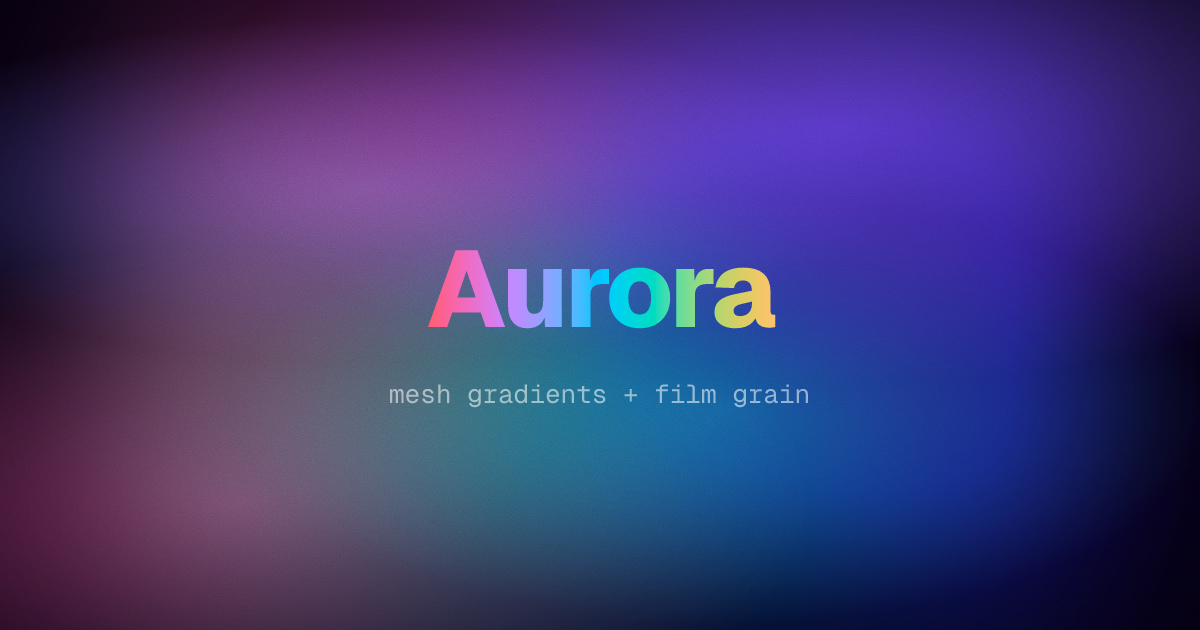
Aurora and film grain
Stack soft radial ellipses that all fade out around 68% for the mesh, and blur a conic layer over it for extra color drift:
background-color: #05010f;
background-image:
  radial-gradient(ellipse 80% 60% at 70% 20%, rgba(139, 92, 246, 0.55), transparent 68%),
  radial-gradient(ellipse 70% 60% at 20% 80%, rgba(236, 72, 153, 0.45), transparent 68%),
  radial-gradient(ellipse 60% 50% at 60% 65%, rgba(45, 212, 191, 0.4), transparent 68%);
The grain is a feTurbulence filter graph on an empty overlay, blended with overlay; it also
dithers away gradient banding. The title crosses the whole hue wheel with two stops through
in oklch longer hue:
.grain {
  filter: url("data:image/svg+xml,<filter>…feTurbulence…</filter>");
  mix-blend-mode: overlay;
}
.title {
  background-image: linear-gradient(to right in oklch longer hue, #ff5f6d, #ffc371);
  background-clip: text;
  color: transparent;
}
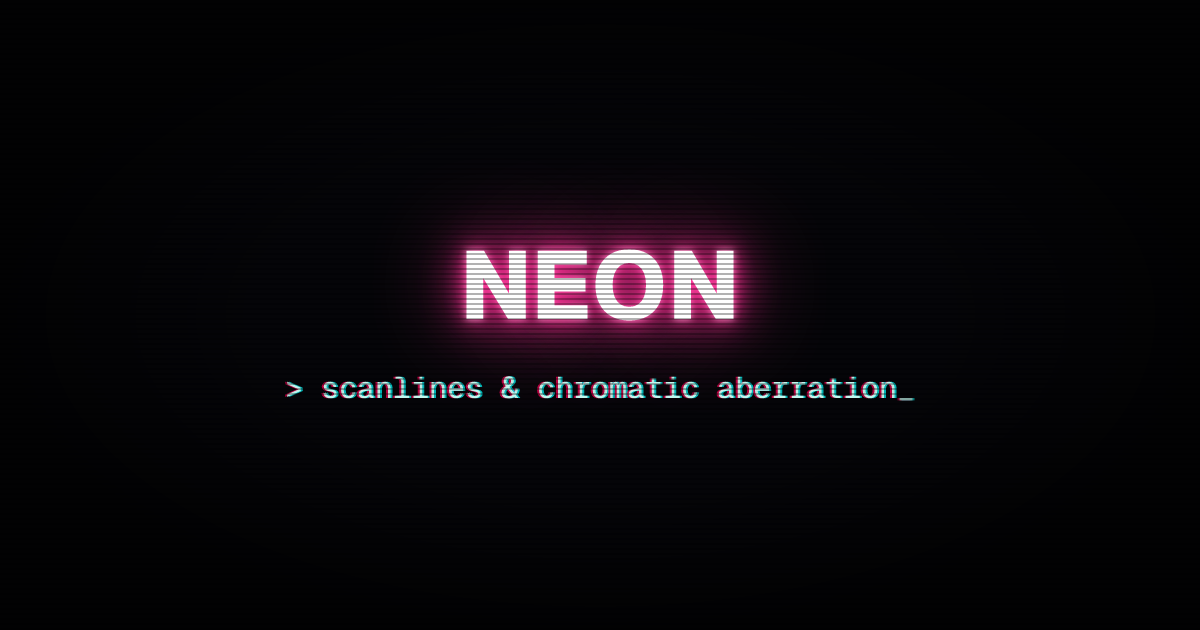
Neon CRT
Neon is stacked text-shadows widening in the brand color; chromatic aberration is two hard
shadows in opposite directions; scanlines and vignette are gradient overlays:
.neon {
  color: #fff;
  text-shadow:
    0 0 6px #fff,
    0 0 18px #ff2d95,
    0 0 42px #ff2d95,
    0 0 90px #ff2d95;
}
.chromatic {
  text-shadow:
    -2px 0 rgba(255, 0, 85, 0.7),
    2px 0 rgba(0, 255, 255, 0.7);
}
.scanlines {
  background-image: repeating-linear-gradient(
    180deg,
    rgba(0, 0, 0, 0) 0px,
    rgba(0, 0, 0, 0) 3px,
    rgba(0, 0, 0, 0.3) 3px,
    rgba(0, 0, 0, 0.3) 5px
  );
}
.vignette {
  background-image: radial-gradient(ellipse at 50% 50%, transparent 55%, rgba(0, 0, 0, 0.6) 100%);
}
Chrome type
A hard-stop metal band gradient clipped to the glyphs; feSpecularLighting adds the bevel rim.
The starburst behind is one repeating-conic-gradient:
.chrome {
  background-image: linear-gradient(
    180deg,
    #0b1020 0%,
    #34304b 14%,
    #c3b9d5 26%,
    #ffffff 34%,
    #5a6cae 48%,
    #ffffff 56%,
    #e8ecff 84%,
    #c3b9d5 90%,
    #211c35 100%
  );
  background-clip: text;
  color: transparent;
  filter: url("data:image/svg+xml,<filter>…</filter>");
}
.stage {
  background-image: repeating-conic-gradient(
    from 0deg at 50% 130%,
    rgba(94, 80, 163, 0.35) 0deg 5deg,
    rgba(11, 6, 23, 0) 5deg 10deg
  );
}<filter x="-20%" y="-20%" width="140%" height="140%">
<feGaussianBlur stdDeviation="1.4" in="SourceGraphic" result="blur" />
<feSpecularLighting surfaceScale="1.6" specularConstant="0.9" specularExponent="40"
lighting-color="#ffffff" in="blur" result="spec">
<fePointLight x="600" y="-60" z="900" />
</feSpecularLighting>
<feComposite operator="in" in="spec" in2="SourceAlpha" result="rim" />
<feMerge>
<feMergeNode in="SourceGraphic" />
<feMergeNode in="rim" />
</feMerge>
</filter>
Halftone
A dot screen in three declarations: multiply a tiled radial gradient with a tone ramp, then crush
it with contrast(). A lighten overlay re-inks the black dots (set isolation: isolate on the
parent):
.dots {
  background-image:
    radial-gradient(circle closest-side, #666, #fff), linear-gradient(115deg, #333, #fff);
  background-size:
    14px 14px,
    100% 100%;
  background-repeat: space, no-repeat;
  background-blend-mode: multiply;
  filter: contrast(14);
}
.ink {
  background-color: #e11d48;
  mix-blend-mode: lighten;
}
Grid hero
The landing-page look: a hairline grid faded by mask-image, corner glows, and a neo-brutalist
card with a hard offset shadow:
.grid {
  background-image:
    linear-gradient(rgba(255, 255, 255, 0.09) 1px, transparent 1px),
    linear-gradient(90deg, rgba(255, 255, 255, 0.09) 1px, transparent 1px);
  background-size: 40px 40px;
  mask-image: radial-gradient(ellipse 70% 60% at 50% 100%, #000 60%, transparent 100%);
}
.card {
  background-color: #fdfdf7;
  border: 4px solid #111;
  box-shadow: 18px 18px 0 #22c55e;
}
Gradient text
backgroundClip: "text" fills glyphs with the background; make the text color transparent:
<h1
  style={{
    backgroundImage: "linear-gradient(90deg, #ff3b30, #ffcc00, #34c759, #007aff, #5856d6)",
    backgroundClip: "text",
    color: "transparent",
  }}
>
  Gradient Text
</h1>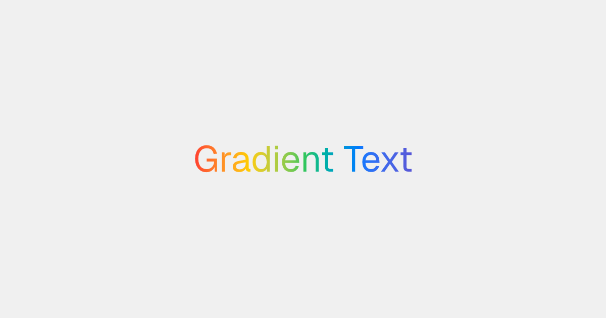
Masks
maskImage fades content through a gradient's alpha channel:
<img src={photo} style={{ maskImage: "linear-gradient(to right, black, transparent)" }} />
Clip shapes
clipPath cuts an element to a <basic-shape>:
<div style={{ clipPath: "polygon(50% 0%, 0% 100%, 100% 100%)" }} />
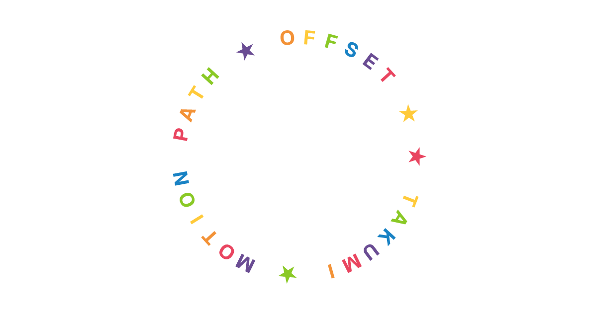
Text on a path
offsetPath places an element along a shape, and offsetDistance picks the spot. Wrap each glyph
and spread the distances to set text on a circle:
const glyphs = [...ring].map((char, i) => (
  <div
    key={i}
    style={{
      position: "absolute",
      offsetPath: "ellipse(240px 240px at 600px 315px)",
      offsetDistance: `${(i / ring.length) * 100}%`,
    }}
  >
    {char}
  </div>
));
Dithering and duotone
filter accepts inline SVG filter graphs as data: URIs next to filter functions, with the full
primitive set (feComponentTransfer, feColorMatrix, feImage, feTile, feTurbulence, ...).
Browsers parse the same markup, so prototype the effect on an HTML page and paste it in:
const filterUrl = (markup: string) => `url("data:image/svg+xml,${encodeURIComponent(markup)}")`;

<div style={{ filter: `contrast(1.4) ${filterUrl(markup)}` }} />;
Threshold effects need color-interpolation-filters="sRGB" on the <filter>; the spec default is
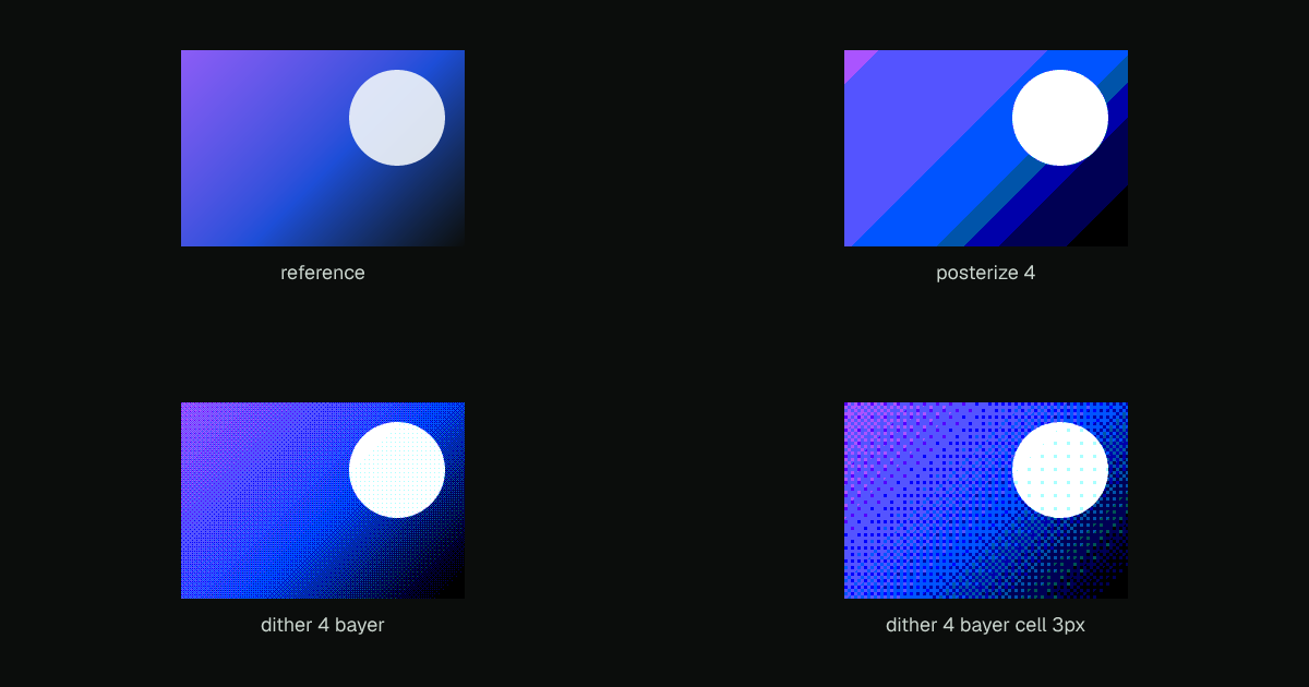
linearRGB. Posterize snaps each channel to fixed levels:
<filter color-interpolation-filters="sRGB" x="0" y="0" width="100%" height="100%">
  <feComponentTransfer>
    <feFuncR type="discrete" tableValues="0 0.333 0.667 1" />
    <feFuncG type="discrete" tableValues="0 0.333 0.667 1" />
    <feFuncB type="discrete" tableValues="0 0.333 0.667 1" />
  </feComponentTransfer>
</filter>
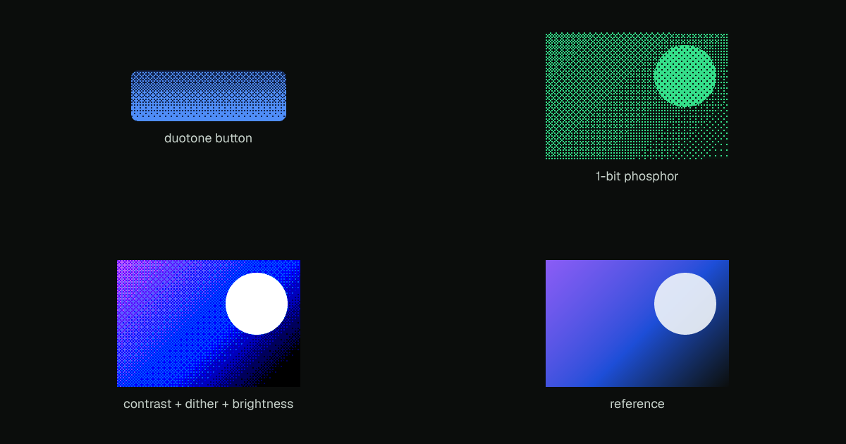
Tiling a Bayer matrix with feImage + feTile and adding it as noise before the quantize turns
the same graph into ordered dithering; a two-color table over a 1-bit luma threshold gives duotone.
The full graphs live in
style_filter_reference.rs.
Error-diffusion dithering (Floyd–Steinberg) is sequential and out of the filter model's reach, in
browsers too. Use the render-level dithering output option instead; see
Output formats.
Last updated on